Visualizing politicians/political discourses on Twitter
Attention!
Check out also our News Challenge Knight's campaign website here
Recently we apply for second time to the Knight Foundation News Challenge. Both times we're proposing hacker/maker spaces as places for bootstrapping social transformation, using education, playfullness and civic empowerment, but this time we want to offer another aproach to build on the experience of our first participation. This post is about what we learned (both times) and what we're doing using the visualization of politicians/political discourses on Twitter as a particular example of the technology and social dynamics we're trying to build.
Here is an outline of this blog post:
- The main learning: campaigns (Knight's News Chalenge and others) as bootstrappers for long lasting dynamics and projects: Or how we want to enable a critical broader discourse (beyond Knight Foundation site, but interconnected).
- Our bet: building continuoums between data+code+document+app & people & places. Here I will point to previous explorations about data narratives and visualizations and why that continuoum is necesary and why Pharo/Smalltalk is particulary well suited for the task, bringing moldable tools and fluent interfaces. People and places are at the core of our bet because informed voting can be a form of social empowerment, and tools are catalizers for that people in these places/contexts.
- The particular process/tools for the visualizations showed here, where I will show how to get the data (scraping and saving) from Twitter, where the data is published and how it can be loaded from our interactive documents on grafoscopio with a walk through for the shor code snippets (6 lines long or less!) that made the visualizations possible.
- What's next? , where I talk about what happens If the convocatory is successful and if it's not.
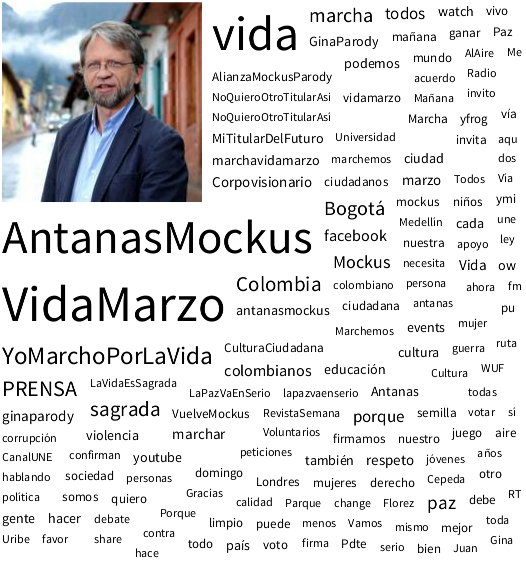
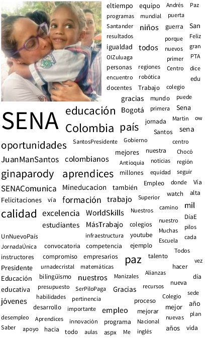
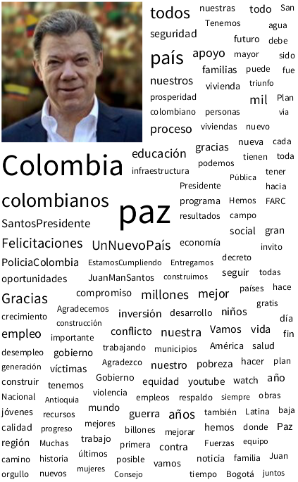
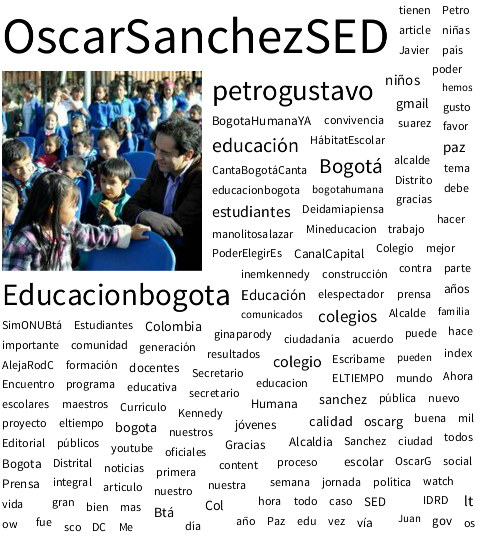
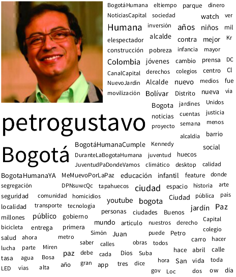
Here is a sneak preview of our advances of data visualization of politicians discourses on Twitter (click on any picture to launch it full screen and browsers back button to return here).


So, if you're insterested, continue reading.
The main learning: campaigns (Knight's News Chalenge and others) as bootstrappers for long lasting dynamics and projects
Engine, the platform for Knight's open innovation campaigns, is a focussed tool, which is fine. It tries to get to the point, and there are recomendations about one sentence descriptors of what your campaign is about. But, as Gauss said, good brevity is more difficult that long writing, specially when you have little time, like in a young project (may be that's why this is a medium size post :-P) so there is a lot of information and interaction that can not be captured in Knight's platform. Engine can be a bridge between like minded people and social innovators if we go beyond the campaign constrains (temporal and others). So this time we didn't use the comments to talk inside the platform, but to point a permanent talk outside it, pointing to blog post (like this one), the project web sites and popular social networks profiles. Also we put a lot of contextual information about our project in the html rich part at the bottom, with several links to what happens elsewhere (source code repositories, academical papers, community places, previous projects and related experiences). In this way our project participation has historical value, but also serves as an inventory of what supports the project and what is happening beyond News Challenge campaign and makes easier future participation on similar initiatives.
Our bet: building continuoums between data+code+document+app & people & places
We, humans, are sense/tool making beings. These tools and senses are developed in social contexts in a intersubjective dialog and in fact they enable new dialogs. For this campaign we have a general premise: politics are complex and data visualizations and narratives are tools that can help us to make sense of what's happening in politics and can enable new dialogs among citizens and between them and the politicians.
But the paradox about digital tools is that despite of being made with the symbolic, soft, "moldable material" of bits, these tools become really rigid and so we end giving our problems the form of our tools, instead of the other way around, creating tools customized to our diverse and specific problems. We don't want this anymore, and so, after testing a lot of tools and approaches, (see the section "What progress have you made so far? of our proposal) we thougth in a different approach: Build a moldable tool, with fluent interfaces to deal with complexity, in particular the one of politics starting with informed voting. Our initial test case would be public political/politicians discourse on Twitter.
If we want accountable politics we need to create a continuoum between data, code, documents, and apps and all of them need to be traceable and open source. By traceable I mean that we need to know the complete history of the data, the code that manipulates the data, the document where you integrate them, and the app where you write/modify that document. And by open source I mean that all of them need to be Free Cultural Works, with proper licenses which state that.
Pharo/Smalltalk is a wel suited platform for building that (a) moldable tools, (b) agile visualizations and (c) continuoums. There are detailed reasons and explanations about the first two in the Moose and Agile Visualization websites. And about the continuoum, in Pharo/Smalltalk there is no gap between the different objects that constitute the computer using experience: When you install and "app" (a bundle of objects interacting together), it automatically comes with its source code, so if that app is being used for data extraction, scraping and manipulation/visualization you can audit the algorithms that make that, modify them to suit your needs and post any modification back to the community, so they can make the same.
This relationship between tools, sense making and community is beyond the reach of this blog post, but I want to point that is the interaction of these three that empowers individuals and communities, so the social dynamics and places where tools are made and used are an important part of the equation and that's why we're proposing intensive hackathons and relaxed workshops as complementary situations to build that tools, intersubjectivities and empowerments and also we're trying to go beyond the screen with tangible visualizations (printed/cutted on 3D) and we hope at some point to build dynamic spaces for understanding politics and other complex phenomena.
So let's see what we have built first on Pharo, following that premises.
The particular process/tools for the visualizations showed here
Let's show first a screenshot of what you can do right now with grafoscopio, our moldable tool for data narratives and visualization used to picture political discourse on Twitter:
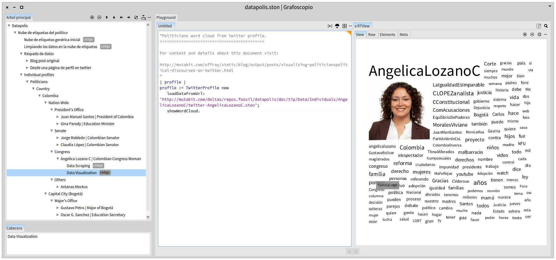
As you can see, the left panel contains a tree, the middle one code or documentation in that specific point of the tree, and the right one, the results of executing the code, in this case a visualization (or other customizations of the interface). The tree gives the context: the politician is a Congresswoman of Colombia. The tree is also a grafoscopio document, so, once you have installed grafoscopio, you can share that tree with your fellow citizens to teach them and/or enable them in the dialog. In fact, the first nodes of the document showed here include all the process and prerrequisites that make the visualization possible, and because of the interactive nature of the document, you can traverse, read, modify and execute the document to verify the results or adapt them to your needs. The document and the data history are on the datapolis source code repository and the code/algorithms for data manipulation and visualization are in the dataviz source code repository and there is also a source code repository for the grafoscopio "app". Grafoscopio smoothly integrates different repositories and data sources in a single interactive document (well almost smoothly, being still alpha code ;-)).
So, where the data come from? They come from scraping the public Twitter profiles of the politicians. Web data scraping could be a sensible issue, but I hope that politicians, fellow citizens and Twitter would agree with me that political/politicians public discourse and participation should be under Constitutional Terms (like Free Speech among others) and not under Twitter API Terms of Service. I hope that we all agree that public democratic concerns should be over private corporate concerns when/if they are not compatible.
So for the purpose of traceability this was what I did for tweets data scrapping:
- Installed the open source Twitter search/scrapper extension for Google Chrome following the instructions on the Data Big Bang blog post.
-
Went to http://mobile.twitter.com/<politician_profile>, where <politician_profile> is the Twitter account name of a specific politician and press the "show" button in the url nav bar, made available by the previous step.
-
(a) Used the DOM inspector (Ctrl + Shift + I) to inspect the created document in the previous step, (b) made click on secondary mouse button over <html> tag at the begining of the DOM and select "Copy" on the emergent menu (c) paste the DOM copied text to a new document and (d) save the html document in my hard disk. This produced over 3200 tweets and a 12Mb file of data.
-
Open the document generated in the previous step in grafoscopio, complemented it with recent information scrapped from the twitter profile and convert it to the STON format using this code:
| profile  dataFileLocation |

"Let's create a new Twitter profile object with the data scrapped from
a particular twitter profile name:"
profile := TwitterProfile new
        scrapDataFromProfile: 'AngelicaLozanoC'.

"Now load the tweets data from a File in the hard Disk to our profile"
dataFileLocation := FileSystem disk workingDirectory / 'Grafoscopio' / 'Projects' / 'Datapolis' / 'Data' / 'Individuals' / 'AngelicaLozanoC'.
profile scrapTweetsFromFile: dataFileLocation / 'tweets-AngelicaLozanoC.html'.

"Finally, save the results"
profile saveToFile: dataFileLocation / 'twitter-AngelicaLozanoC.ston'
This convert the file generated in previous to a compact format without all the html, with a compression ratio 12 to 1 (For the tweets I'm just storing the text, without retweet, date, or other information)
- Upload the Ston files for several politicians to the online repository.
And for the data visualization I just run the code in the "Data Visualization" node for each politician in the grafoscopio document. The code is just 4 lines long:
| profile |
profile := TwitterProfile new
    loadDataFromUrl: 'http://mutabit.com/repos.fossil/datapolis/doc/tip/Data/Individuals/AngelicaLozanoC/twitter-AngelicaLozanoC.ston';
    showWordCloud.
Our grafoscopio document includes these two previous snippets for each politician in two nodes, one called "Data Scrapping" and the other "Data Visualization", respectively, of course with the proper adaptations for each Twitter profile.
Thats how I generated the word clouds for all the politicians at the begining of this post.
As I said in a previous blog post (in Spanish), a proper release of grafoscopio will happen after the upcomming release of Pharo 4 and Moose. But if you fee adventoruous you can:
- Follow the source code installation instructions from our alpha manual (in Spanish).
- Download the datapolis.ston file with all the detailed examples explained here and open it on grafoscopio.
- Comment on this blog post or drop me a line about your opinions, comments and impressions on this idea, its implementation and future or anything related.
What's Next
This is just the begining. There is a lot of room for improvements on several aspects. I will list them first, but at the end I will talk about the most interesting thing to come. Hopefully both of them will be integrated organically so as we do the interesting, the improvements will come (that's how is happening right now).
- In the grafoscopio ergonomy: keyboard shortcuts, graphical interface updating algorithms, contextual menus, windows menus.
- In the Dataviz package on: layout of the word cloud, making the avatar go into the center; the data cleaning algorithm to quit url shorters and other noise on the final word cloud and a better control and customization of uninteresting words (what is interesting for some can be uninteresting for others). Also would be nice to have better navigation, so if I made click on a word I can go to all tweets that contain them. More details on the tweets, storing dates, retweet and other data besides the tweet text. A way to remote control the chrome/chromium browser, so you can integrate scraping inside Pharo.
As I said, the most interesting visualizations are still to come. I have called the next one "Silence Maps" and will be talking about the following question: Do politicians and public institutions monologue or dialogue on Twitter? Keep the sintony!
So what comes next in terms of the News Challenge call? Well, if we made to the final round and get the money, surely we will need to increase the translation of interface and documentation to English, start making unitary test and improvements overall with a bigger and exclusive team. Winning will speed up the things a lot! If we don't win, we will keep our current peace: without rush, but without pause, developing this ideas in our spare time.
So visit our site at http://mutabit.com/grafoscopio to see our improvements. We're living interesting times!
Comentarios
Comments powered by Disqus