The leak about offshore companies and tax heavens is the biggest one in history upto now in size, reach and complexity, but despite that, the curated data released to the general public is pretty small (~36 Mb of compressed data). This could open an oportunity for a more plural comprenhension and participation of the interested citizens with an approach that combines reproducible research, data activism and frictionless data and could draw some insights and recommended practices and technologies when more information and other research becomes available.
IMPORTANT NOTICE
This blog entry and its
related software artifacts
were updated to work with the last data dump that includes Offshore Leaks (2013) and Panama Papers (2016).
We're living in times of tension regarding data collection and releasing. On one hand, private and public institutions are collecting more and more data about almost anything and, on the other, reserchers in academia and journalism, whistleblowers, hackers and activist are releasing more and more data also. A core question about this tension is who is empowered by this dynamic of collection and releasing and how. Mainly because of the policital nature of data (see for example raw data is an oxymoron) and the claims that can be done or not because its presence or absence. In this scenario the plural ability to participate of the claims, to confirm or deny them, to made new ones, and to mobilize discourses and actions powered by data and related artifacts (visualizations, queries, etc.) becomes crucial.
This text proposes a way to bootstrap and enable this plural participation by recommending practices and prototyping artifacts that join several topics and interests: reproducible research, data activism 1, data visualization, data provenance 2 and frictionless data 3, using the Offshore Leaks Database, which joins Panama Papers and offshore Leaks investigation data, as an example. Because plurality is a core concern, the prototype environment and workflow should be simple, affordable, explorable, traceable and bridge a continuous between almost raw data and the operations and transformations on it, like visualizations and queries, that are used to build argumentation from data.
I will start comparing two data visualizations about Offshore Leaks, telling why one is not reproducible and the other is and then I will present the environment that made possible such reproducibility and the practices that would help with this, ending with what is comming in the particular case of this prototype and in general for the partnership between, civil society and jornalism to keep the powerful accountable.
Story of two maps
Look at these two simple maps above. Both referred to the offshore leaks news, but with visible differences:

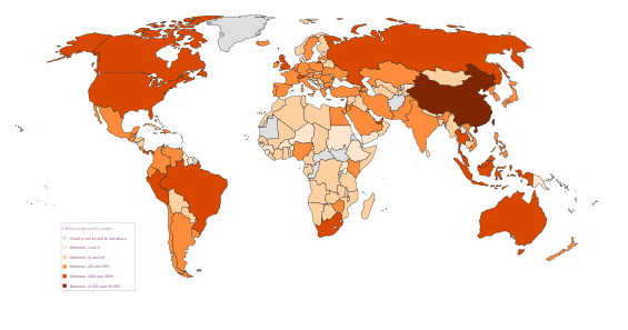
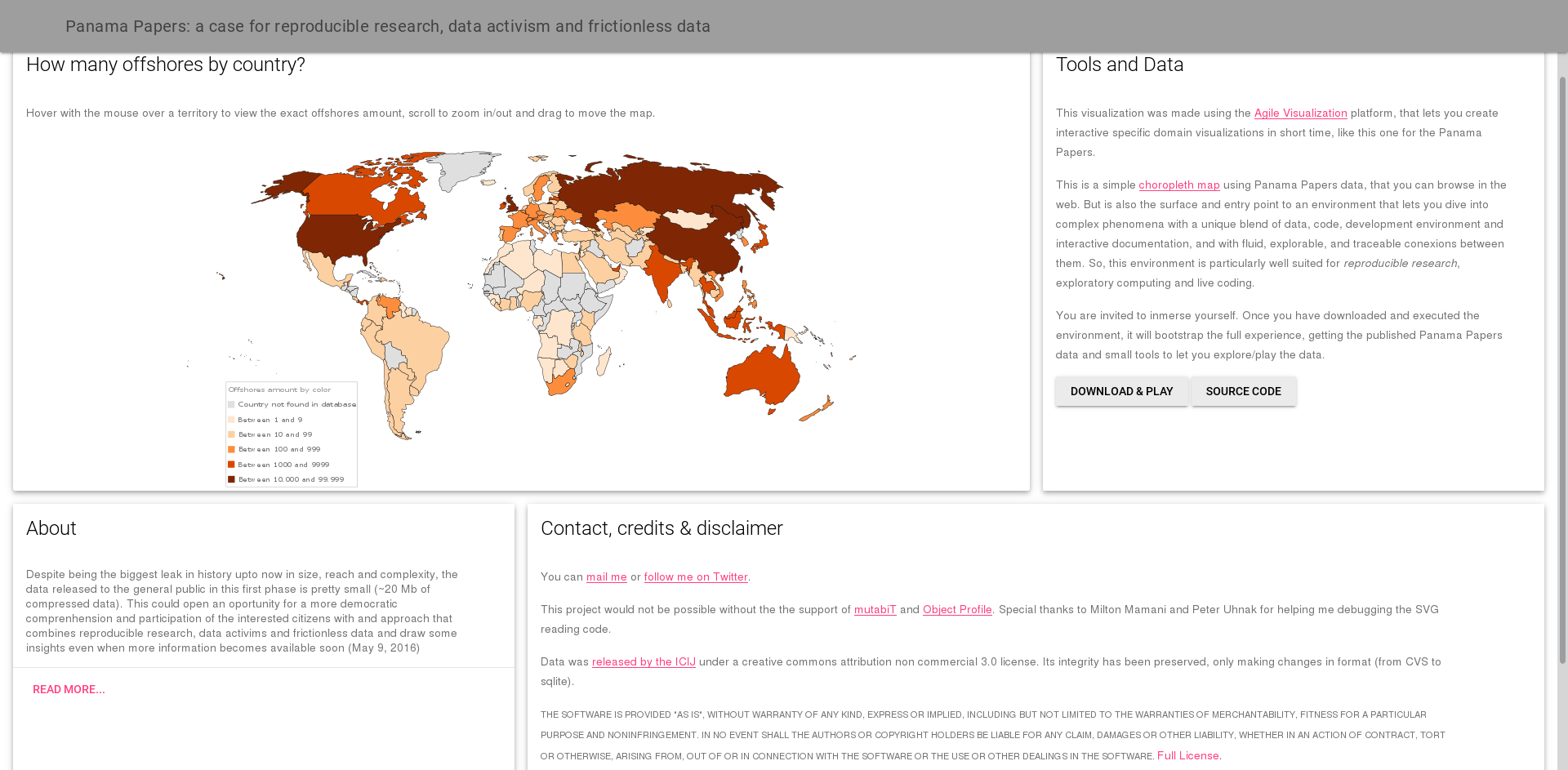
^ Figure 1| Two maps about offshore leaks: Left one (fig 1a) from Panama Papers (2016) and
is irreproducible from released data, Right one (fig 1b) from the Offshore Leaks (2013) and reproducible.
Could the new released of data made the left one reproducible? How Wikipedia should publish/support such visualizations beyond svg?
Click on each one to see the enhanced version.
- The left one answers to which countries have politicians involved in the Panama Papers (2016) and comes from Wikipedia4. The right on answers to how many offshore companies are registered by country in the Offshore Leaks Database (2016 and 2013) and comes from me.
- The left one cannot be reproduced with the public data released when the map was shared. The right one can be.
The researchers of the International Consortium of Investigative Journalist (ICIJ), are releasing more data to backup the metodological approach in the phrase "Sometimes you even have to go one step further and look for their family members", and make explicit connections for the offshores data and the ones behind the power.
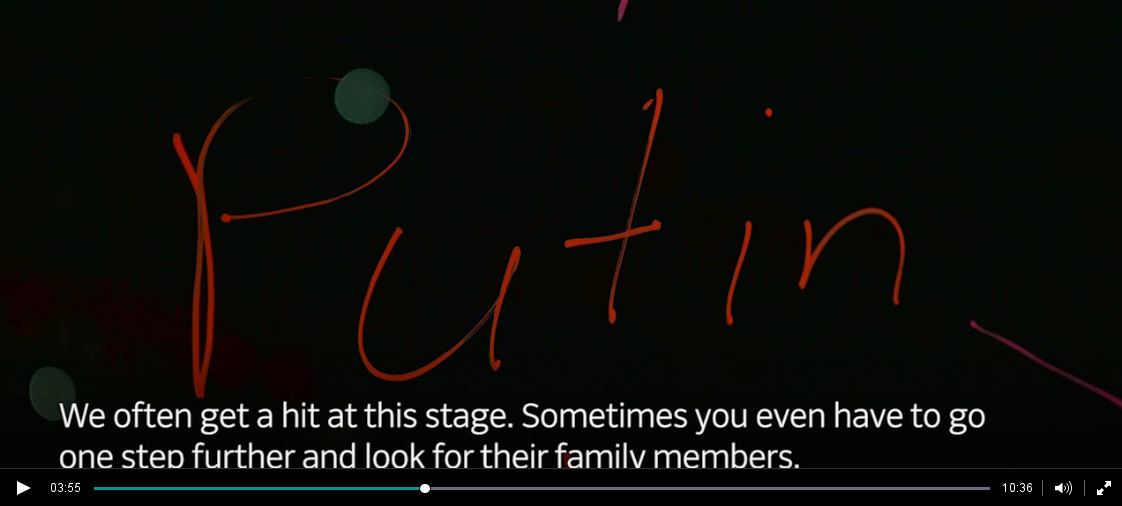
^ Figure 2 |A screen capture of the video where two ICIJ describe their methodological approaches.
Part of them were captured in the released data and other in the released articles.
With the upcomming release of more data, we would expect more of ICIJ findings to be reflected
on it. Click on the image to go to the full video.
But releasing more data does not make those maps, other graphs or visualizations easily reproducible. We need to know the queries used to cross the data and produce aggregated views of it, and the code that takes that aggregated data and create the map visualization.
The ways of approaching this research reproducibility & participation problem fall in two extremes: one is complicated, multilayered, requiring a lot of large team expertise and big machines; the other is simple, available to small groups/communties, could lead to individual mastery (but don't start there) and use your common personal computer. Telling data stories today and releasing them to the public, means to traverse the bridge that joins these two ways, so our research become more open, participative and reproducible. Let's call this the Big Bridge.
ICIJ has made a lot of work and we could take a constructive approach to understand, complement, enhance and criticize it. The question I will address is: what could be done to make the Panama Papers research deal with the previous reproducibility and participation gap, specially regarding "data related artifacts" (tables, queries, visualization, code)? That is the focus of the next section, taking into account the experience of working with what has been released until now to create the reproducible map and finishing with some future scenarios.
An environment for participatory reproducible research
Data provenance is a formal way to answer where this data representation comes from? Taken in a broader sense, the question can refer to a table, a query answer, a data visualization and the operations and behind all of them. But also it could be extended to include the social actors behind of and affected by the data: funding, spending, instruments, methodologies and so on, would be part of the answer.
One example on the social issues regarding Panama Papers comes from several campaigns on Twitter, organized mainly by Panamanians after the leaks, to show that Panama is more than Papers and that this should be called Mossack Fonseca Papers, because it creates an stigma over all the country and leaves out of radar others tax heaven territories with similar practices and a problem that goes beyond Panama. There have been also questions about who funded this long complex investigative effort and who benefits from the scandal, or how it can improve democracy and accountability.
These are important issues that should be addressed, including to release as much metadata as possible about the research and the entities behind, while protecting the privacy and integrity of the people involved. Also ICIJ has adopted a gradual liberation strategy that keep the balance what is released and what is protected5 and have showed aspects of their methodology (I have no data about funding sources and amounts, at least in a place provided by ICIJ, but could be just that I miss it).
The Big Bridge, refered before, that will help the readers and citizens in making sense of complex data stories and participate actively of them requires to address several gaps. An important one is the gap between almost raw data, on one extreme, and (complex) visualizations in the web and print, on the other. I will use the released data and the choropleth map as a way to exemplify suchs bridging prototypes, that could help in shielding the research while opening its data and findings for interested parties and citizens. For that, I will focus next on two complementary approaches and tools: The first is what we could call frictionless data and metadata, to extend the Open Knowledge Foundation (OKFN) term; and the second is what we could call data continuum environments, that bind data, with its representations, transformations and processes in a simple, affordable, transparent, explorable and continuous (eco)system.
Frictionless (meta)data
Part of what makes the choropleth map visualization possible is the data release strategy
followed until now by ICIJ: small batches of important data in standard simple formats.
In this case, a zip file of comma separated values stored in plain text (CSV) of just 36 Mb with
four files (called Addresses.csv, all_edges.csv, Entities.csv, Intermediaries.csv and Officers.csv).
You can quickly download it; import it into the simple, ubiquous and powerful sqlite database; republish it into a community data repository, to make your new and more convenient data format 6 traceable and available, and start to explore and query the data to make sense of it.
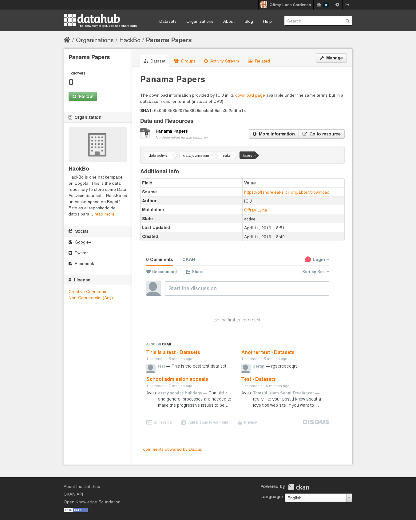
^ Figure 3 |A screen shot of the DataHub repository with all the Panama Papers data released before May 9 of 2016, nicely formated in SQLite. Click on the image to go to the repository.
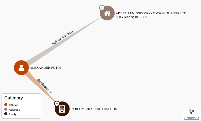
Once you have some interesting query and result, you can share it on twitter or with a little more time start to bind the data to other environments as show in the picture (4b) (but we will come to that in the next section).
Correction: @AlvaroUribeVel sons are in 2013 offshore leaks and the Uribe Moreno Family is in #PanamaPapers pic.twitter.com/080nDGs8Lo
— Offray Vladimir Luna (@offrayLC) 11 de mayo de 2016
^ Figure 4 | Two data exercises with the released data: Above (fig 4a) An early query and its tweet follow up, and below (fig 4b) a query already integrated in the live coding and data visualization and interactive documentation environment.
So there is a lot of what you can do even with this small curated data release. And this idea of small meaningful and nicely operable data pieces resonates with the idea of frictionless data of the OKFN, so I would add something more to make the exploration of the data easier:
- Add metadata about the structure of the data: Instead of putting your user to reverse engineer what tables and columns represent, state this explicitly7, maybe using data packages, tabular data packages or CSVY all having the advantage of packaging the license with each copy of your data.
- Add metadata about the research itself, particularly funding. ICIJ has released the story behind the story: the whistleblower and his/her motivations, the metodology and tools and this is metadata in the sense that is information about information, but is important to put some of it, particularly funding resources, in data form.
- Use signatures to verify the integrity of data: As the source of data, put SHA or MD5 alike codes that let the users know that download is complete and data integrity at their end is the same that at the source.
- Versioning and API: A way to know the history of the data and a way to interact with it, even if you have not downloaded the complete database (like in my case) as this may become more difficutl as the data released increases. What I did to provide this features was to republish the data using datahub.io, that provides both, versioning and API (even if I'm using it now only as a storing/sharing utility).
The technology stack that ICIJ is using is pretty solid and pretty complicated, as you can see. Could an alternative technology stack empower citizens, individuals and small entities to work with the data? The example of the choropleth map shows this is possible. Next section will deal with the details.
Data continuum environment: data <-> queries <-> code <-> visuals <-> docs
This is the core idea of this section:
The reader can become the explorer/co-author in the same full continuous environment that the author used to create the published data visualization, with a single kickstater click.
In the time of "big data" and web/mobile only, multilayered and complicated platforms and discourses favoring only them, my approach will seem unorthodox and more like the old time of desktop apps or even before upto the times of the dynabook. But I subscribe (like others8) to the idea that keys from the future could be in "forgotten" ideas from the past, and that putting them to talk with our present concerns and technologies, could enlight the path forward. Also we will consider real connectivity and computing constrains, like the ones experienced in the Global South frecuently9. This means that we will use current data formats and bindings and use the web as an important publishing/sharing/interaction medium, without trying to reduce all to it, to make all web/mobile native or thinking as the web browser like the fat client of everything and also implies designing for times of offline and online interaction with the data.
I'll talk here about building a simple affordable and continous environment for reproducible research and data activism, like the one showcased in working prototype. By simple and affordable I refer to the fact that it is easy to install, runs on your current laptop/desktop or a USB thumb drive (and would do it in your tablet), and that deals with the "a single kickstater click" part of the core idea. By continuous I mean that it blends data, live coding, dev environment and tools and interactive documentation in a fluid, explorable, modifiable and traceable way. This is a continuoum of data and visualization, so the reader does not deal only with raw data on one extreme and/or visualizations on the other. All this characteristics help in participation, understanding, extending and modifying and deal with the part of the core idea that says: The reader can become the explorer/co-author in the same full continuous environment that the author used to create the published data visualization.
First lets see a screenshot of my working prototype created with the suggested environment and then I will present you the parts of it:
^ Figure 5 | Panama Papers reproducible data visualization minisite. Click on the image for visiting the site.
The environment I'm building/using for creating all the parts previous place from data to visuals to minisite, has the following parts:
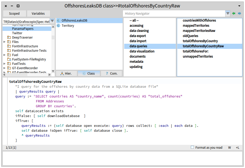
- SQLite and DB Browser for SQLite to import, preview and query the data comming from tables in CSV format.
- Agile visualization platform for prototyping/building the visualizations, live coding, debugging them, reading from and exporting to web formats (SVG) and source code management.
- UDBC for bridging the first two, making data and queries available, modifiable and traceable from the agile visualization platform.
- Grafoscopio for interactive documentation (plus some text editor like Kate or Geany, for editing exported docs).
- Fossil for source code management of documents and source files.
- Grav and Material Design Lite for publishing this blog and the project minisite.
That is. This compressed environment should weight like 35 Mb for Gnu/Linux, which is a good metric, if we consider that the size of ICIJ compressed released data is almost the same size. Because I'm including the agile visualization platform, there is a lot already integrated there and that's precisely my point: You don't need to care for a lot of moving parts, because the ones already chosen solve the problem in the other extreme of the spectrum, once the curated data has been released and let the reader/explorer work with it, using his/her current laptop/desktop, mostly by unzipping files and running them (except for grav which has the same philosophy, but requires a little configuration).
So that adress the affordable and simple part.
For the continuous part I would try to illustrate my workflow with the following diagram:

^ Figure 6 | Workflow for the creation of the visualization and its supporting publications (minisite and this blog post). Click on the image to see the larger version.
Each rectangle represents a task/process that happens inside an environment/tool(s), which are represented by circles. As you can see, rectangles connect circles because some processes/tasks are bridging them, or shared, while others happen almost exclusively inside a particular environment. And also you can appreciate that a lot is happening inside the agile visualization platform and that this platform and Grafoscopio connect the extrems between raw data on the left and publishing on the right. This is because Grafoscopio provides the notebook functionality: Notebooks are the way of making data storytelling and presenting data visualizations, queries and other software artifacts to the readers/explorers. They let me structure the drafts of the story in dialog with the software visualization and the live coding environment, so I can write/think in prose, data, code and visuals, switching from one to another and present this, nicely packaged, to the reader/explorer. This whole blog post was in fact was wrote as part of a interactive notebook and next exported and edited for the web. Other parts of the notebook let the explorers to follow the steps of the "Quick start" and being iniciated in the live coding environment and what is behind the visualizations (see screenshot below).
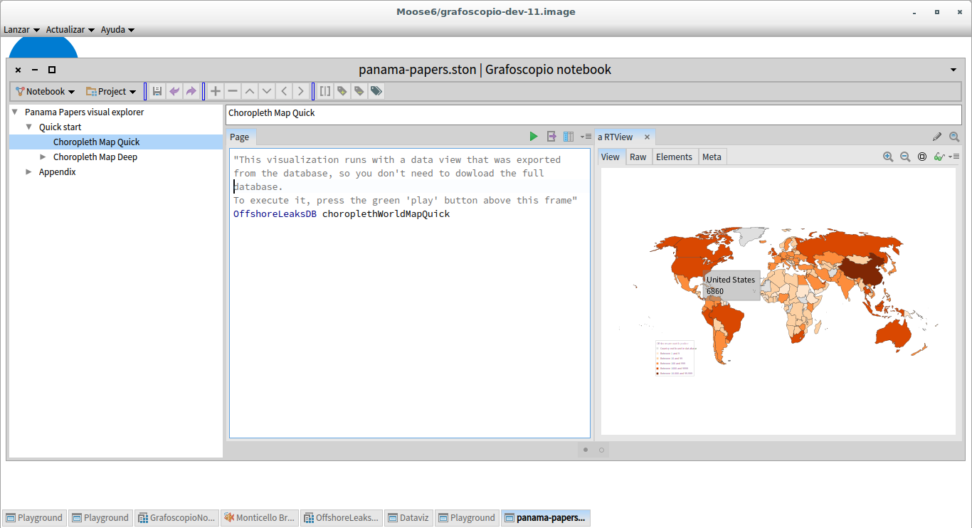
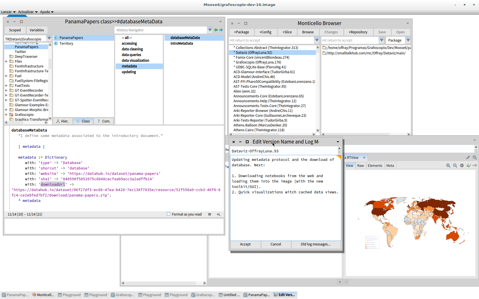
^ Figure 7 | Data continuoum environment its current incarnation inside the pharo image: Above (fig 4a): Introductory interactive notebook, with step by step executable explanations on how to replicate the data visualization from the downloadoable data and also quick visualization to start with. Below (fig 4b): The environment once you have dive in, used in actual development, with source code writing and management facilities and the introductory notebook at the bottom of all windows.
What's next: data activism tools, practices & citizen partnerships to keep the powerful accountable.
At the beginning of last month (April 3rd), what is called as the biggest leak in history and know as the Panama Papers, was revealed and the first batch of public data was available to the public. At the beginning of the this one (May 9th) the second batch of data was released, integrating the first one and improving the understandability (I worked with both versions). The fact that they are relatively small batches of curated data opens an oportunity for greater engagement, participation and reproducibility of this and other research, and puts under the radar unseen but powerful choices regarding technology stacks for the readers/explorers to create a closer relationships with the complete data. The whole batch with hundreds of thousands of records10 was pretty manageable with this technology. But still, there is work do be done on small and large scale.
On a small scale this is what comes next:
- I will focus on heavy refactoring of the Grafoscopio's notebook, to make the experience friendlier a clean the rought edges, and migrate it from the Pharo 4 / Moose 5, where it was developed to the upcomming major versions of those platforms to be released in just few weeks. Grafoscopio should provide a more cohesive experience integrating external parts, like data importation, view and querying, fossil source code management, and web publishing, by creating and integrating graphical user interfaces (GUIs) for them, specially in how they're combined (instead of trying to replace/hide the GUIs of DB Browser for SQLite or Fossil). Because Grafoscopio and its notebooks are an important part of my PhD research, I will focus on improving the experience of writing, reading and exploring them.
- Panama Papers are an example of what can be done with tools like the ones described here and is sure that this will be added to our gallery as a important example for our future data week workshops in our local hackerspace so other citizens, studens and/or journalists can learn from it and extend it. In such workshops we could improve and stabilize the code, improve visualizations and keep a look to future releases of the data to see how easy is to interact with it and if some of this ideas and contributions or better ones are in some way incorporated there. I hope this inspire others for similar approaches on making partipatory reproducible research or to help me with this particular approach and problem.
On a bigger scale, Panama Papers could become and important exemplar of new citizen and jornalist partnerships where data activism and data journalism inform each other, to keep the powerful accountable. We have seen arguments underlying the importance of such alliance to made the most of releasing data, supporting factual argumentation and transparency like the one in Does Open Data Need Journalism? What we have seen mostly until now are opaque partnerships of goverment with private interest to make the rich richer and even helping the powerful to evitate social redistribution of wealth that should be at the core of taxing. Tax heavens have important implications that reach lives of common people everywhere and probably next to you. This means that we, as a civil society (including researchers, hackers, activists jornalists), need to reimagine new ways of participation in dialogue with ONG, public and private institutions and hopefully with their support for a more just and equitative society. Technology could play an important role in this escenario, but only if it enables us to participate in a plural understanding and building of this shared complex world we inhabit, that is mediated by data.
-
Data activism is an emergent term, less well defined that data journalism, but equally important as an activity. For an introduction see Big data, data activism, and the global civil society, Civic hacking as data activism and advocacy: A history from publicity to open government data, Statactivism: Forms of Action between Disclosure and Affirmation. As you can see, in some parts of these works, there is also a critical approach to the fact that what matters is not data size, but is more about dynamics of control, agency, who data is empowering and how, specially from the perspective of civil society, which resonates strongly with the approach of this article. ↩
-
For introductory texts to data provenance see: Data Provenance: Some Basic Issues, Data provenance – the foundation of data quality and Data Provenance: A Categorization of Existing Approaches ↩
-
Frictionless data is a term pionered by Open Knowledge Foundation with a particular implementacion using CSV and JSON, but the core idea that what matter with data is packaging to enable interaction, instead of size, could be implemented using other combinations like CSV + YAML. My personal preference are human readable formats like YAML and TOML for documentation and metadata, but there is good compatibility among them. ↩
-
I have chosen this particular map, because this Wikipedia article will be the entry point for many to the understanding of the Panama Papers. As more data becomes available, research reproducibility and data provenance will become a more important issue with visualization put in several places, like Wikipedia. ↩
-
ICIJ has chosen a multi-release strategy to curate the data and to keep the balance freedom of important information and protection of sensible personal information (like email and phisical addresses). This is one of the reasons why 2.6 terabytes of source data can be released as few Megabytes of curated data. For details about this releasing strategy see: Coming Soon: ICIJ their particular ideasto Release Panama Papers Offshore Companies Data ↩
-
Look at a quick overview in http://sqlite.org/appfileformat.html or a longer explanation in SQLite as an Application File Format talk by Richard Hipp recorded at 2014 SouthEast LinuxFest, for interesting arguments and scenarios about using SQLite as an application format. In my own experience, with little overhead over the original CSV files (sometimes even decreasing the size) you get a smarter, well document, cross-platform data format to storage, share, cross and query your data. ↩
-
There is and improvement at least in the naming of tables we pass from
countriesNW.csv,edges_1DNW.csv,node_countriesNW.csvandnodesNW.csv, in database of the offshores leak from 2013 toAddresses.csv,all_edges.csv,Entities.csv,Intermediaries.csvandOfficers.csvin the integrated database. ↩ -
For a deeper explanation of this approach to design, looking for bifurcation points of the past in dialog with the present to inspire the future see my draft text: Ecología de Saberes en Diseño: Un ejemplo desde los discursos autopoiéticos where I revise the ideas of Wolfgang Jonas and others. ↩
-
There are some environments for reproducible research, like JupyterHub, wakari or binder, but they hide (accidental?) complexity behind the browser and pipes, some of them are unavailable in your local machine, and/or requiere very good connectivity. Packaging systems, like docker are making installation easier, at least on Unix derived systems (Gnu/Linux, Mac), but still the layers that create interactive documents from data are pretty opaque or complex and thus difficult to modify and adapt, which is also an important concern about empowering readers/explorers with this data environments. ↩
-
The size of the database can be calculated within the environment by running:
OffshoreleaksDB databaseMetrics. Click on Reach and limitations] node inside the grafoscopio notebook too see more details. ↩