A teaser of the the history of visualizations on an upcoming open research about some medicines public data that is released by government organizations on 16 countries.
My friend Yaneth is finishing her post-grad studies on epidemiology and hopefuly soon will be presenting the final dissertation in her faculty at Universidad del Rosario, in Bogotá, Colombia. Her research could be informaly stated as how much information on certain medicines is released by government agencies which have such responsability? This blog entry is a small teaser of the history behind her research and the role of data visualizations on it, which usually doesn't get told in more formal writings. It is told from my point of view while helping her with the visualizations, with some final considerations about improving the code, research publishing and understanding by visualization, but I strongly recommend to read her full text once it will be released (I will be linking it here, once it's released with code and data minor improvements, but in its current state you can get a general overview of what's happening.).
The question came to us in one of our usual afternoon coffee talks. She was telling to me about how difficult was to get health related information for her previous post-grad research projects and how frustrating it was, so I told her something like: "What about making such difficulties your research itself? This lack of information could by shown by comparison: Showing the invisible by contrasting it with the visible". We talked more about the details, how such comparisons could be possible (using graphs as a first draft) and then she preseted the idea in her faculty.
She made a lot of hard work by defining an instrument directed towards experts to know which medicines were important in this research context, selecting and querying the different government medicine agencies, curating the information, looking for possible data visualizations and building a lot of big matrixs to hold the collected info. Then she asked me: "from the perspective of a newbie, which could be the best tool for making a visualization like this one:"
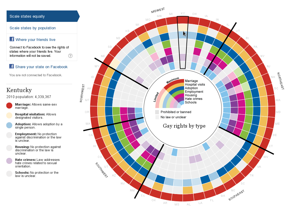 ^Up | Gay rights infography screenshot that served as model.
Click for interactive web version
^Up | Gay rights infography screenshot that served as model.
Click for interactive web version
We ended up with something like this, as the main theme of several visualizations:
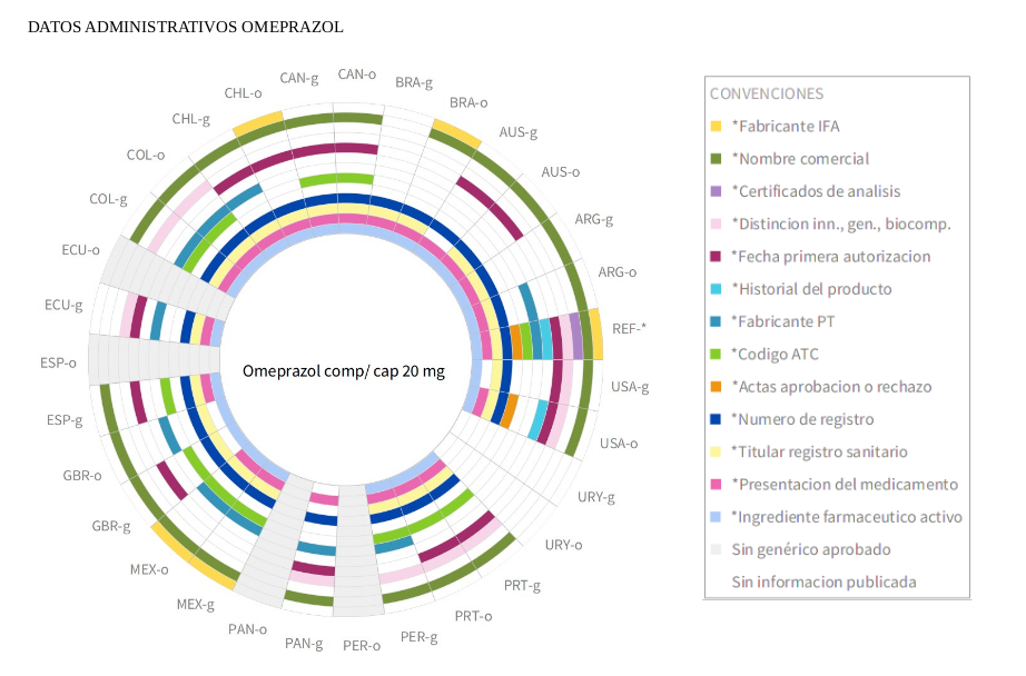
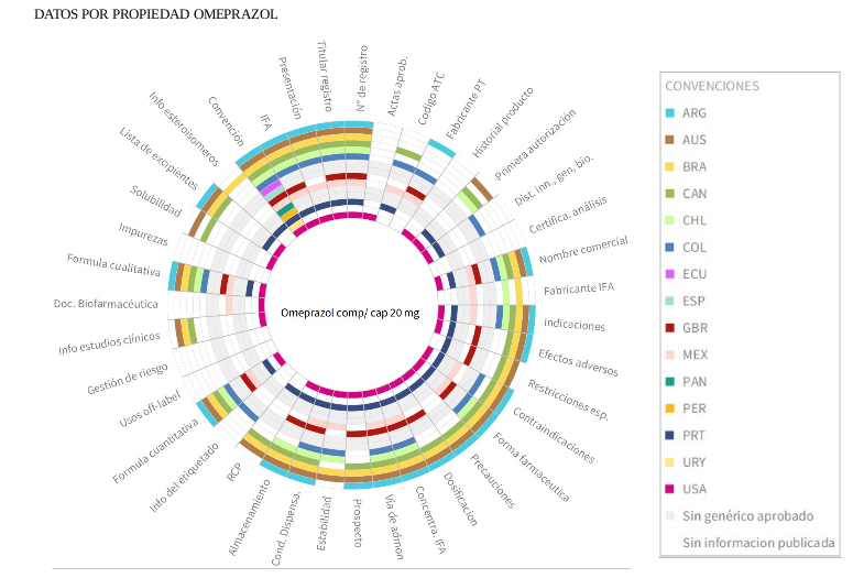 ^Up | Matrix sunburst made with Roassal for visualizing published
prescription and use data for omeprazol medicine released
by govenrment in 16 countries.
Colors indicate the presence of information according to the conventions at
the right, while white and grey colors talk about information absence or
not approved variants.
For a futher complete analisys I recommend to read the full thesis soon.
^Up | Matrix sunburst made with Roassal for visualizing published
prescription and use data for omeprazol medicine released
by govenrment in 16 countries.
Colors indicate the presence of information according to the conventions at
the right, while white and grey colors talk about information absence or
not approved variants.
For a futher complete analisys I recommend to read the full thesis soon.
But thats a big jump to almost the end of the story. If you want to know how we went from the inspiring first javascript visualization to the final Roassal data visualization, what I learned and what comes next, keep reading.
We began considering well stablished tools, like d3.js, but I told Yaneth, that, as a newbie on data visualization (and I'm kind of one) I would choose Roassal, because you get a more interactive experience while developing the visuals. In d3 (or similar tools), once you have a rough napkin draft of what you want, you're dealing with a file and trying to picture the data in your head while writing javascript code, and then refreshing the web browser to know if your imagination was right, and if not you're on a static error trace trying to figure out what went wrong. By contrast, in Roassal, once you have a rough napkin draft of what you want, you benefit from the start of the Pharo live coding environment where Roassal inhabits. You begin with a model of the data objects in your domain and then you write a domain specific language for the things you want to do with that data model: importing information, defining prototype visualizations, extending color palettes, adding labels and so on. If you made an error, a live error trace comes to you and you can debug or even extend your domain model, all while interacting with live data and views objects. At the end, you get Domain Specific Visualizations (DSV) with their own Domain Specific Language (DSL) and, if you want, you can share them easily because there is no gap between the data visualization and the developing environment. Web is more like an "exportation format" where you can see and interact with the final result, but you're not constrained by the web file/browser workflow while building it.
I had made some data visualization experiments before with Roassal and gave a try to d3.js, so I got a sense of this kind of workflow (without knowing all the details) when I gave my advice to Yaneth. Now was time to put it into practice.
I started by browsing at the data visualization galleries of Roassal example browser, looking for something that seem similar to the proposed visualization, and I found several ones in the sunburst section, and choose the closer one to start with:
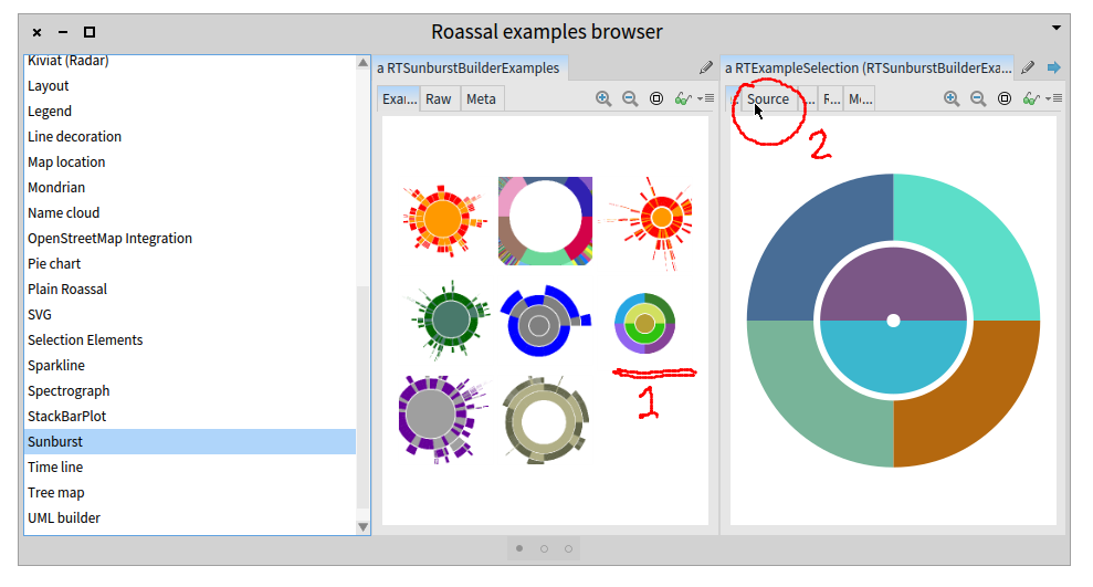 ^Up | Sunburst subsection of Roassal examples gallery.
Clicking first in the underlined graph at 1 gives us the depicted zoom in
at the right, and then you can choose the enclosed source tab at 2 to look
at the code.
^Up | Sunburst subsection of Roassal examples gallery.
Clicking first in the underlined graph at 1 gives us the depicted zoom in
at the right, and then you can choose the enclosed source tab at 2 to look
at the code.
The problem was that sunburst is usually defined to explore hierarchical data, and Yaneth's matrices don't have that form: they're two dimensional sequential data (rows and columns). A clever hack came from Miltón Mamani, a Roassal hacker I was introduced by Alexandre Bergel (via email), while Miltón and I were attending Smalltalks 2015 in last November. In a pair programming session, Miltón converted the matrix secuential data to hierarchical one using collections of collections. After returning back to Colombia, I adapted Milton's code to use grafoscopio's trees to convert the matrix to hierarchical data. The napkin draft of this procedure looks like this (code details about its final implementation are in the DataViz SmalltalkHub repository):
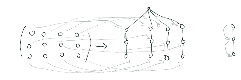
a↑: From matrix to tree and children off-spring direction.
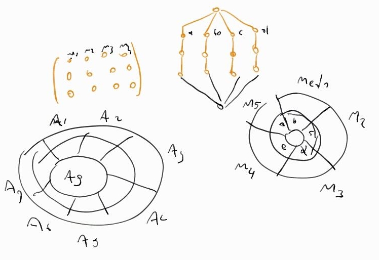
b↑: Inverting the root of the tree to make the matrix sunburst to coincide with rows direction: internal down, external up.
^Up (a and b) | Some hand draw draft to think/clarify the idea of converting from
matrix to trees, and from there to sunburst.
Having worked out the important part , I produced the first "real visualization" and showed it to Yaneth, and we start to refine it with her new requests and her ideas about visuals, colors, arc width dimensions and new data visualizations to show complementary views on the same information. We even read some code together (despite of our different approaches on this!), trying to make sense of how to improve the visuals.
These are the "almost final" complete visualizations for a single medicine (click on each image to enlarge):
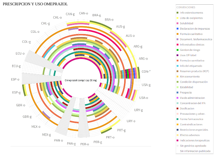 ^Up | Three visualizations of the same data for the omeprazol medicine.
The total number of medicines is seven (so it makes a 21 visualization total).
They're:
(top) administrative released data by country,
(middle) prescription and use released data by country,
(bottom) administrative prescription and use released data by property.
Radial names in the cicle border correspond to country names using
ISO 3166-1 alpha 3 standard.
"b" and "o" letters stand for "original" and "biosimilar" variants of the
same medicine.
^Up | Three visualizations of the same data for the omeprazol medicine.
The total number of medicines is seven (so it makes a 21 visualization total).
They're:
(top) administrative released data by country,
(middle) prescription and use released data by country,
(bottom) administrative prescription and use released data by property.
Radial names in the cicle border correspond to country names using
ISO 3166-1 alpha 3 standard.
"b" and "o" letters stand for "original" and "biosimilar" variants of the
same medicine.
And this is a quick overview of the domain specific language for them:
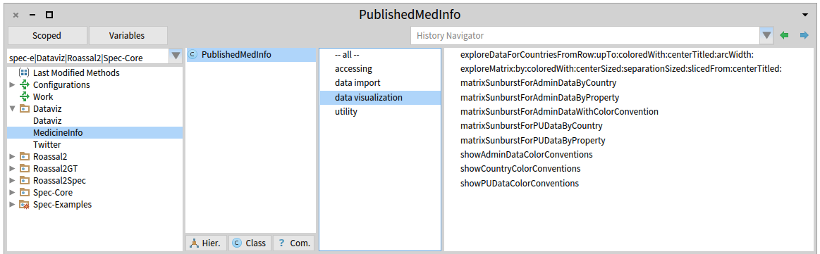 ^Up | A glimpse of the Domain Specific Language (DSL) associated with the
Domain Specific Visualization (DSV) for this field.
Highlated protocol at the third column (left to right) contains the main messages, while
other, in their respective protocols, are used by this ones.
^Up | A glimpse of the Domain Specific Language (DSL) associated with the
Domain Specific Visualization (DSV) for this field.
Highlated protocol at the third column (left to right) contains the main messages, while
other, in their respective protocols, are used by this ones.
There are several medicines and visualizations, but, despite being public information, is a very important one, so Yaneth wants to triple check everything before releasing the data. She is considering to publish on an open access magazine (and I think that something like plos medicine, plos ONE or the recent plos meta-research could be good candidates for an open research like this one). But I'm getting ahead. As I said at the begining, I strongly advise to read their full research and related papers once she completes all the administrative paper work related to presenting her findings, visuals and analisys.
Some last words on the experience of creating this visuals:
- The experience was pretty smooth, stimulating and agile in general and compared with the stuff I have tried before in other platforms and communities, it took less time (even considering the learning time) and was funnier. The Pharo community was as supportive all the way, as always. Thanks specially to Alexandre Bergel for leading Roassal project and team in general, Milton Mamani for the startup visuals, the matrix to tree idea and rotated labels, Peter Uhnák for helping me out with debugging the positioning of such rotated labels and Ben Coman for proof reading this blog entry (of course any reamaining errors are my fault).
- Developing data visualizations in Roassal has a lot of advantages, as stated before, but in this case, where they end into the print/pdf writing is even better. A lof of interaction/exploration possibilities inside Roassal are lost, even if this were a "web exportated product", as Yaneth envisioned some time ago, which, by the way, is doable in Roassal, so can you program/explore in it and end with an image like in this case or with a web interactive graphic. But we know that thesis mainly circulate these days as pdfs, so would be nice to have a grafoscopio companion interactive notebook, linked to the pdf/print thesis that can be run inside a full Pharo/Roassal live coding flexible environment with all the benefits of it. In fact, in the future such documentation could be used to write the whole thesis (that's the approach I'm taking with mine, while I develop the tool).
- There are stil some improvements to be done code wise. Mainly the exploration of the Tree Object instead of the grafoscopio trees, which also solves a possible circular dependency. I didn't know it existed despite looking for it before starting grafoscopio, but this is a good sign of the new discoverability improvements on spotter in the upcoming Pharo 5, letting you find packages to be installed yet in the catalog browser, while using installed ones with similar names. In fact depending on this I could revise the whole tree implementation on grafoscopio and start to work with a more mature core tree object.
- Big thanks to Yaneth! for letting me be part of this and letting me learn and experiment with such a rich and important data set and for insisting in several aesthetics aspects of the visuals even under time presures. I hope this brings some visibility over her works and helps the reader to navigate this amount of complex data. This shows that definitively there is a big place for small but important frictionless data. It taught me a lot on data visuals, being my third SDV, and in my own research it starts to show two different paths about grafoscopio users/makers: most probably they will approach SDV for their particular problems and other few will do from the core functionality of the notebook interface. One of my hypothesis was that such domain specific visualizations and languages could be the bridge between novices and experts and the field domain knowledge and core functionality. A theme to be expanded later.
- In the future I will work on two small data visualizations that I have called data selfies and data portraits. Stay tunned.